The Serious Type
Artist Collaboration Website, Phase 4


The Serious Type (TST) brings artists and creators together for collaborative projects.
Rooted in art education and environmental sustainability
Connect artists and other creatives who share the same passion
Collaborate on projects, inspire and uplift one another
Tools
Figma
FigJam
Notion
Slack
Google Docs
Timeline
8 weeks, Agile
My Role
Content Strategist & UX Writer on a cross-functional, remote team
UX Team(23)
Content Strategy/UX Writing(4)
UX Design(6)
UX Research(5)
Product Strategy(4)
Development(4)
Client Team
Founder (artist/teacher)
Client Consultant


Project
An online platform where creatives can join a shared mission — while contributing, learning, teaching, and inspiring one another in collaborative creative work.
Users and Audience
Artists (professional and amateur) and other creatives, writers, educators and volunteers
Ages: 30-50 (shift from a teen focused platform in earlier phases)
Challenges & Constraints
Conduct research and design simultaneously for a new platform
Short timeline: (8) one-week sprints with weekly client demos
Must keep existing product name
Unclear branding and target audience
Focus of This Phase

Discover how/why creatives decide to join TST

Encourage sharing of work and help creators find trusted collaborators

Design the onboarding flow
My Team: Content Strategy/UX Writing
Initially, I worked with 1 lead and 2 other members
As the weeks went on, two team members were pulled onto other projects, so my contribution increased.
Content team worked mostly asynchronously.
Content team coordinated with other teams through Slack, virtual meetings and remote work sessions.
My Responsibilities:
Write copy for menus, headers, sub-headers, buttons, and long form content as needed
Frequent review of screens/flows in Figma
Cross-functional demo preparation
Represent Content team at client demos, stand-ups and cross-functional work sessions
Competitive Analysis
Content Audit
Information Architecture
Content Style Guide
Brand development
color palette selection
typography
tagline
My Top 5 Tasks
Weekly Schedule: Content Team
(avg. 20 hrs/week)
Monday - Friday Daily stand-up (1 Rep from each Team)
Monday
Work session (Design, Content, Research, Product)
Sprint retro and planning (All teams)
Tuesday
Work session (Content)
Wednesday
Work session (Content)
Work session (Design, Content if available)
Thursday
Work session (Design, Content, Research)
Asynchronous demo prep (All teams)
Friday
Client demo
Quick debrief

My content team’s tasks during this 8-week sprint:
-
Competitive analysis
Concept testing
-
Content Audit
Draft Site Map (Content)
Review concept testing results from Research
Extract “Jobs to be Done” from concept test results (All teams)
Review experience (journey) maps from Research
Prioritize user flow(s) for Phase 4
Review Design team’s wireframe sketches
-
Review user flows from Design
Prioritize “How Might We” questions (All teams)
Review low-fi wireframes from Design
Voice/Tone brainstorming
Lexicon decisions
-
Outline Content Style Guide
Provide content strategy for Design for low-fi wireframes, flows, navigation, scenarios
Asynch review/feedback for onboarding screens, Landing page, navigation, and Gallery page
Continue cross-functional team meetings with Design and Research teams
Review Design System from Design team
Dev team recommends and begins training on a low code platform
-
Continue lexicon decisions
Create word list for Content Style Guide
Preliminary research indicates pain points with some vocabulary terms
Use word list, voice characteristics, and preliminary research findings to inform content for the Landing page and the About page
Share first draft of Content Style Guide with all teamsDiscuss Site Map with Design team: move some items to 2nd level navigation
Feedback to Design team for onboarding and finding a collaborator flows
Client surprises us during demo, so Product team advises scope adjustment
-
Typography specs to Design and Dev teams for Design System
Write microcopy
Site map alignment across teams
Begin color directions with Design team
Prioritize task flows for user testing
-
Content for About page to Design
Feedback to Design for hi-fi wireframes
Feedback to Design for color palettes
Content Style Guide revisions
Coordinate with Design for Coming Soon page content
Cross-functional prep and presentation to client: user flow and 2 color palettes
Research team conducts usability tests
-
Review results from moderated usability testing
Incorporate research results into screens and microcopy
Finalize Content Style Guide
Finalize site map
Research runs unmoderated usability tests, all teams review results
Continued feedback for design iteration
Cross-functional prep for final demo showing project journey and prototype
Final client demo
All team retro, wrap up
My (Pre-Project) Discovery
I reviewed previous phases of this project to get up to speed.
Just prior to this phase, the project had pivoted from teen social media to adult creatives. I could see major changes coming.
To understand this change, I consulted teammates who worked on earlier phases to uncover client motivations and what caused this pivot.
Competitive Analysis
All teams worked cross-functionally to narrow down a list of over 50 potential competitors and identify the most relevant. It helped us clarify what we thought the Client was after.
This project would be a new type of platform due to the user group pivot, so we asked our development team for their recommendations.
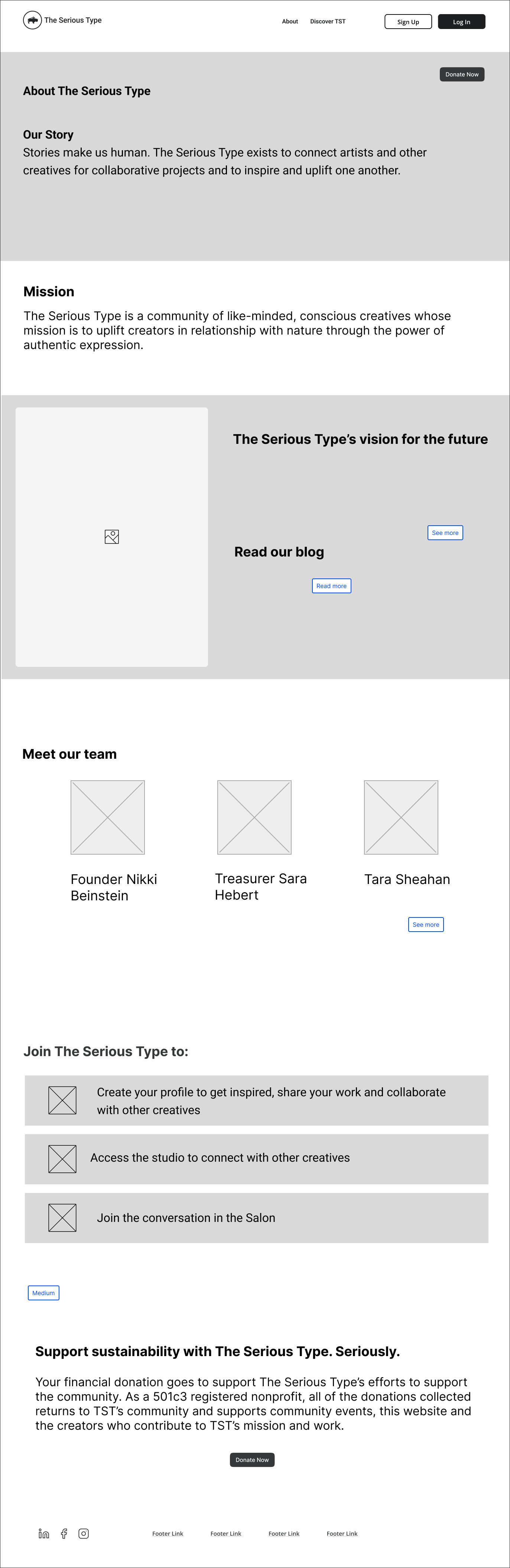
Content Audit: Existing Website
All members of my content team completed this, then compared notes.
The existing site had functioned quite differently than what the Client had in mind for this current project.

Existing TST website pages

Definite lack of branding
No clear information architecture
Disconnect between the organization name and mission
Concept Testing: User Interview Insights

(From research team)
Users share their work to connect with other creatives

Users value feedback from trusted sources

Sharing work can be vulnerable

Advocating for Content Strategy / UX Writing
Challenges:
From the beginning of the project, the Design team dove right into creating screens before we were in agreement across all teams.
Working across time zones from California to Europe was a challenge for our team.
Our Content Strategy team lead was instrumental in advocating for the Content team to be an active part of all cross-functional meetings with Design and Research.
This helped streamline efforts, and kept content consistent and on-brand.

One of our strengths as a large UX team was our excellent and inclusive communication via Slack. We added a channel for cross-functional team communication.
Team-wide posts invited others to cross-functional live work sessions within Figma. This was my favorite way to work.
Information Architecture (IA)
By this point, the Client had described to us how they thought this website might function, and what they wanted to include.
This image shows some of the text and language from the Client

By week 2, the design team was already creating screens and developing user flows, but no one had brought up information architecture.
We needed to better define the Information Architecture.
This inspired me to do a quick sketch. The team used this for the next client demo.

Initial phase 4 site map
The IA evolved slightly over the course of the project, as we met with the Client and clarified how this structure fit their needs.
Content Strategy Goals
Communicate TST’s mission, professional expectations, and options quickly and effectively through proper navigation and page content
Include privacy control for project owners
Collaborate with Design team to design onboarding flow
Begin to develop a brand direction

How might we…
encourage creatives to share their work?
create a sense of trust and professionalism?
efficiently connect people for ongoing projects?
Working as a Large Team:
Define the Problem & Align the Team
As a large team of 23, we had to stay connected and aligned as we worked on weekly deadlines.
We worked to understand and integrate this Client’s vision for the 4 main parts of this website’s ecosystem: Studio, Gallery, Experiences and Salon.

Studio
Gallery
Experiences
Salon
Great, but what do these terms actually mean?
We needed to find out.
This project had a lot of ambiguity, a challenging client, and several quick pivots.

Pivot
from: [teen] social media platform
to: collaborative work platform for [adult] creatives

Surprise!
Halfway through the 8-week sprint (!) the Client did this:
Revealed that another team was building core sections of the platform and some functionality
Unexpectedly revised the project scope, removing a few main areas of the website
Priorities going forward would be: “My Studio”, profile creation, and onboarding
What we did next:
We held an urgent all-team meeting, and realigned the project scope accordingly, focusing on the new priorities.
It was frustrating for some, but I have adapted to similar shifts before.
Working with Ambiguity
We filled in a few more blanks. With research.
Example: Client was still unsure of the target audience
What We Did:
The large team chose the [adult] age demographic. The research team did some quick concept testing, and the results supported this choice.
This helped us to develop a brand direction.
Usability Testing Results (1st Round)
Names of features and sections didn’t follow conventions or were unclear
Use of social media hashtags from previous phases now less relevant
Need for varying levels of project access and privacy protections
from Research Team

Content team action items: lexicon choices, content structure, and navigation
Words like salon and media were still confusing for our test users.
Creating the Content Style Guide
Content Strategy:
Content Team (4 of us at this point)
This type of document was new to this organization. My team developed a Content Style Guide to provide consistency with:
Naming conventions
Lexicon choice
Defining TST’s online presence
Branding
I worked mostly asynchronously on Notion with my team, using a template from a previous project.
“TST is built by creators, and above all we value having a space for all to share their creations.”
TST’s voice & tone:

empowering and encouraging
empathetic
welcoming, inspiring
reliable
facilitating growth and awareness
“TST’s voice is like a guide who welcomes and encourages visitors to make full use of a collaborative community to share, connect, and inspire others.”
We needed to be fluid when approaching this project. This Client left a lot for us to determine and create.
My team determined the branding strategy, using feedback from the design team. We felt like we had some freedom, but we weren’t sure the Client was sharing everything.

Brand Development: Tagline
The Client wanted to keep their name: “The Serious Type”
Would this resonate with their target users?
I explored ways to relate this name to their organization…
While considering TST’s mission, I came up with this tagline:
We’re serious about creating

The Client liked it, then added:
to uplift the future
This evolved to the tagline we used for the rest of the project:
We’re serious about creating an uplifted future

Typography
My team’s responsibility was to brainstorm then narrow down 2 typography options.


Option A
Option B
Our design team used option A for the wireframes.
The serif typeface conveys a certain reliability and maturity, while Karla (sans serif) was considered in both options for readability.
Color

In the previous phase, this Client liked several color palettes. This was a good place to start.
We selected this palette to show the Client.
They didn’t respond in any way. When we asked them what they thought of this palette, they said they didn’t know.


Without feedback from the Client, it felt kind of arbitrary. We had another palette ready to show if needed.
Since most of us on the Content team were also UX designers, the design team asked us for feedback on the design. We relied on information from the previous phase and our collective experience.
UX Writing: Lexicon Development
As early as we could, my team determined lexicon choices for the Content Style Guide and for user testing.
My content team needed to decide which terms and language worked best.

Early project brainstorming using FigJam
Clarifying Navigation: Menu Labels and Categories:
Once the research team presented their findings from user testing, we had the data to support our decisions.

After user testing the (social media) label “Feed” was changed to “Updates” in the menu bar.

During user testing, this “Needs” category was tested as “Opportunities,” but users preferred the more specific label “Roles Needed.”
Preferred & Non-Preferred Language

We came up with a list of “preferred” language for common use cases. We included this in the Content Style Guide.
For example, the word “contributor” was vague and had multiple meanings in the context of thier organization. We decided to use other terms to make this differentiation clear:
“donor” = financially supports or contributes
“creator” or “co-creator” = someone who contributes their effort and talent toward a project
UX Writing: Microcopy
As I reviewed the Design team’s iterations, the hardest part was feeling like I was keeping up.
I commented about language use, but as a designer I also engaged in design discussions and acted as one more set of design eyes.
I looked at everything from a content strategist’s perspective. I evaluated how the design presented the information.
Goals for microcopy content:
Adhere to the content guidelines as they developed
Implement the correct use of the lexicon
Case use consistency
Language readability
My contributions:

Content for toast pop-up messages
Instruction sentence structure for clarity

Consistent case use on button text and form labels
Content for radio button choices


Voice and tone consistent with Content Style Guide and on-brand

Titles and descriptions for Community Guidelines
I was the primary content designer for this screen.
The design team had created some main ideas and placeholder text.
I transformed these statements to align with TST’s voice and tone.
I replaced the “no” phrases with positive language, and had a little bit of fun with the tone.
How My Content Team Worked with the Design Team
There were 2 of us left on the Content team by this time in the project: myself and the team lead.
We both had experience as UX Designers.
Early in the project, the Design team asked my Content team for specific design feedback regarding button color/size, background color, etc.
A cooperative effort:
The About Us page was content-heavy, so the Content team took the lead on the initial wireframe, then passed that off to Design, consulting after that.
The Design team took the lead on the landing page, but frequently sought our input during the design development.
My day-to-day:
Asynchronous work with meetings and messages
Live, cross-functional work sessions in Figma
Reviewed the Design team’s first pass at the screens, and left comments or joined calls when things needed discussion

Live, cross-functional Figma work sessions were my favorite way to work.
Content Strategy: Onboarding
Focus: Sign-up and profile creation (purple)

Content strategy goals for onboarding:
Clear CTA’s to guide users
Invite users to connect via common interests
Use high-level goals and interests to create matches with other users
Quick intake using 3 screens
Mid-fi Onboarding User Flow
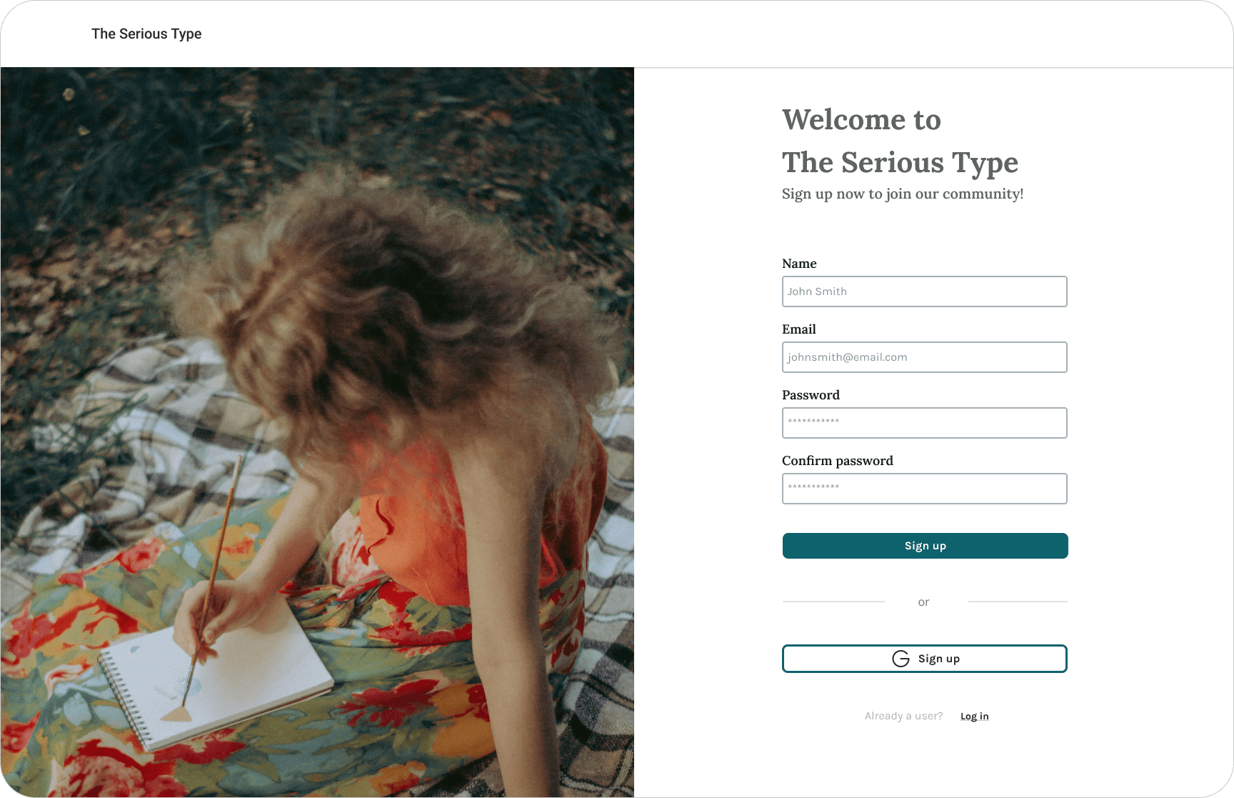
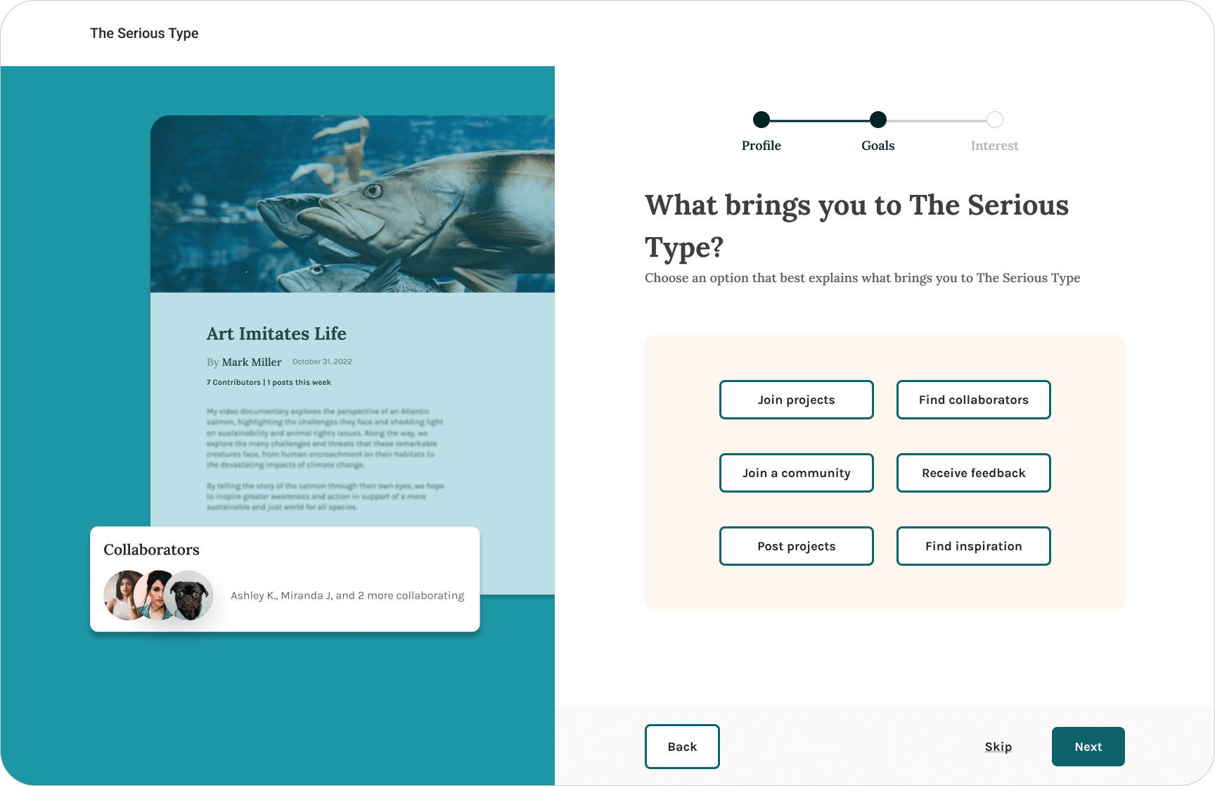
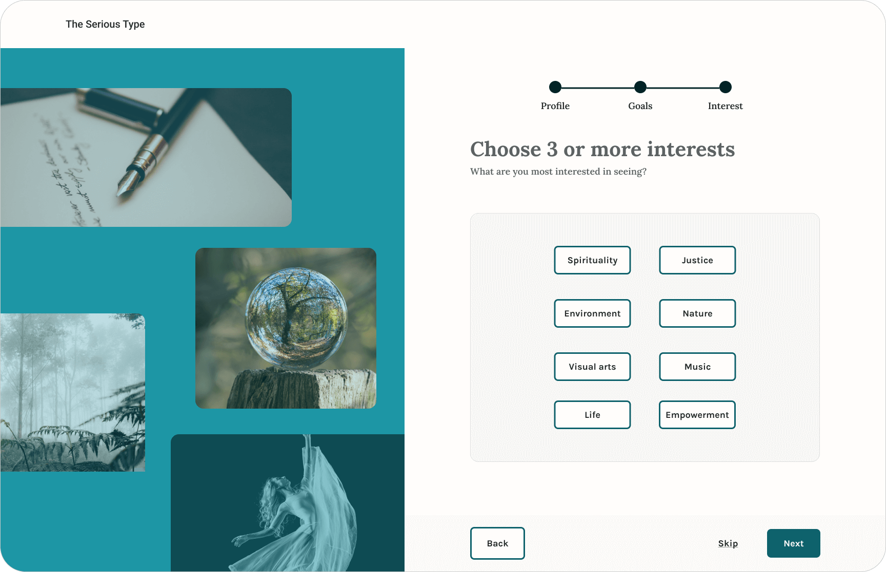
Clear instructions and selections
Progress bar
Options to skip or go back
Content Team focused on:
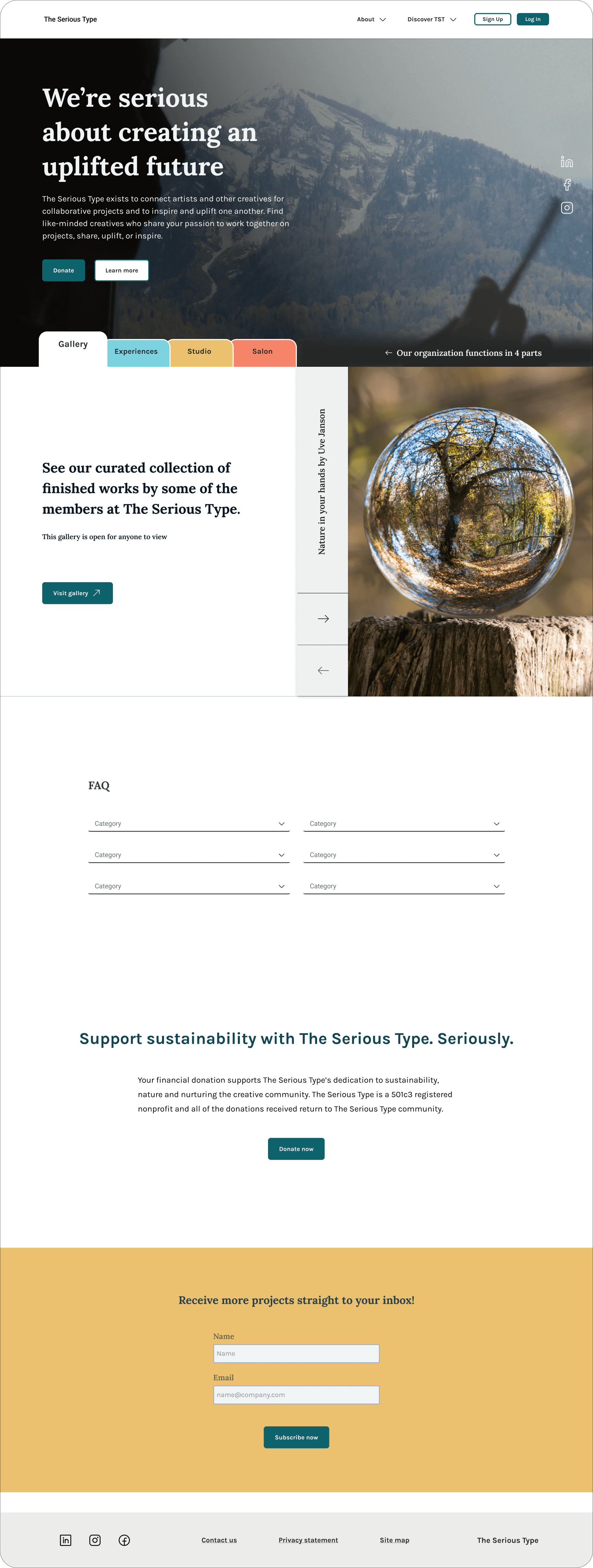
Design Progression: Landing Page
Lo-fi
Image collage does not have clear CTA
Need to show 4 parts instead of 3
Is there the better page to search for projects?
Screen is long for a landing page. Move some content to other pages
Not sure this placeholder color is on-brand


Mid-fi

Shows 4 parts of TST
Tagline is developing
Too much text at once about the 4 parts
Very basic UI yet, needs more development
Some content may be better placed on other pages, needs more work
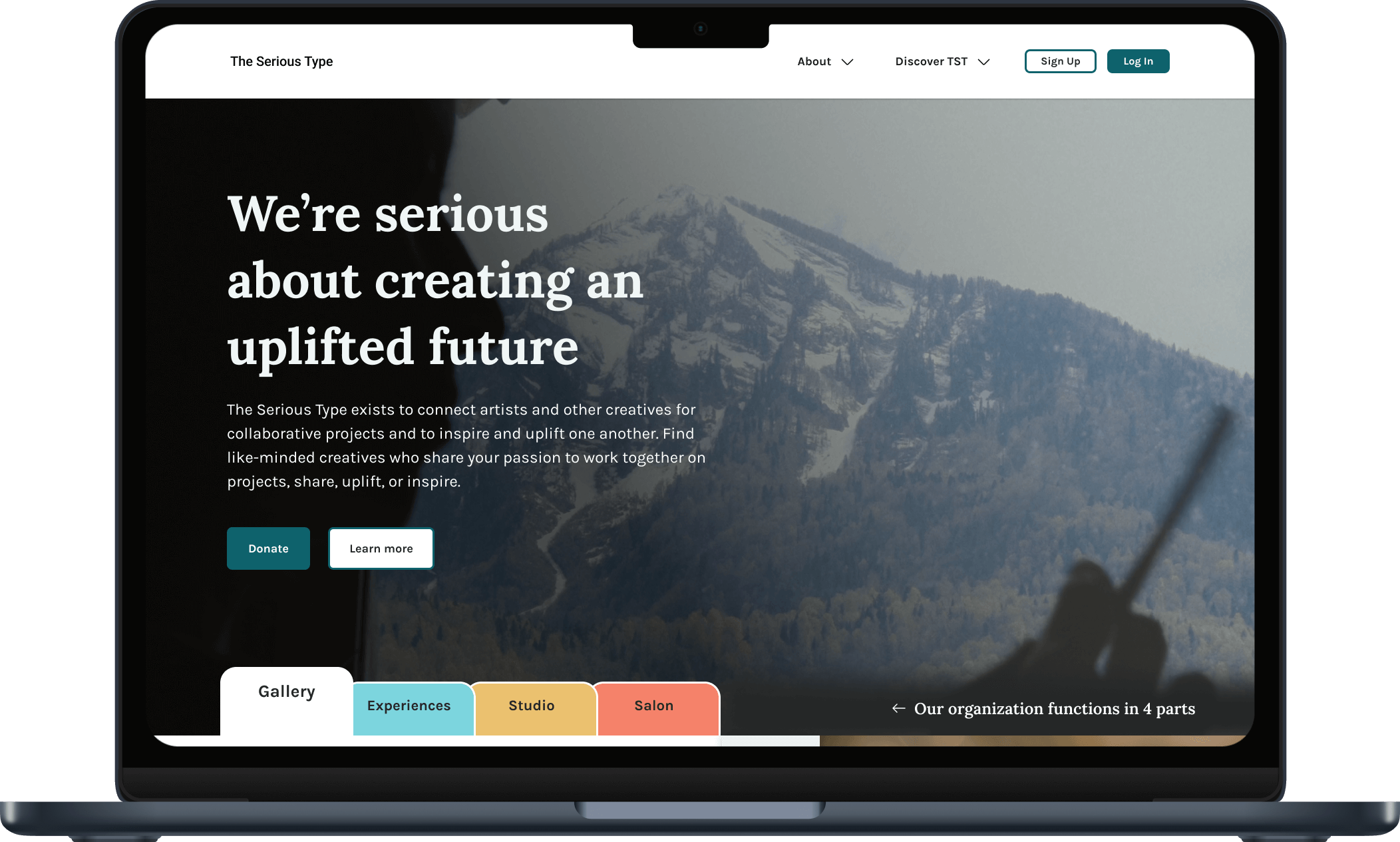
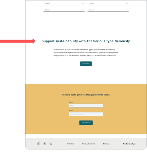
Final landing page

Clearly shows 4 parts
Balance of text, images, and white space
Concise information
Demonstrates sample color palette
Tagline helps communicate purpose
Content Strategy: Landing Page
Present information quickly and clearly. Welcome users to the site like an art gallery guide
Easy to read description of this organization
Simple definition of each “tab” and where it leads

Clear navigation offers more information before clicking a CTA
Click on the “tabs” for information
Hover state highlights the tab
Each tab shows more information and CTA description
Video of landing page tab navigation
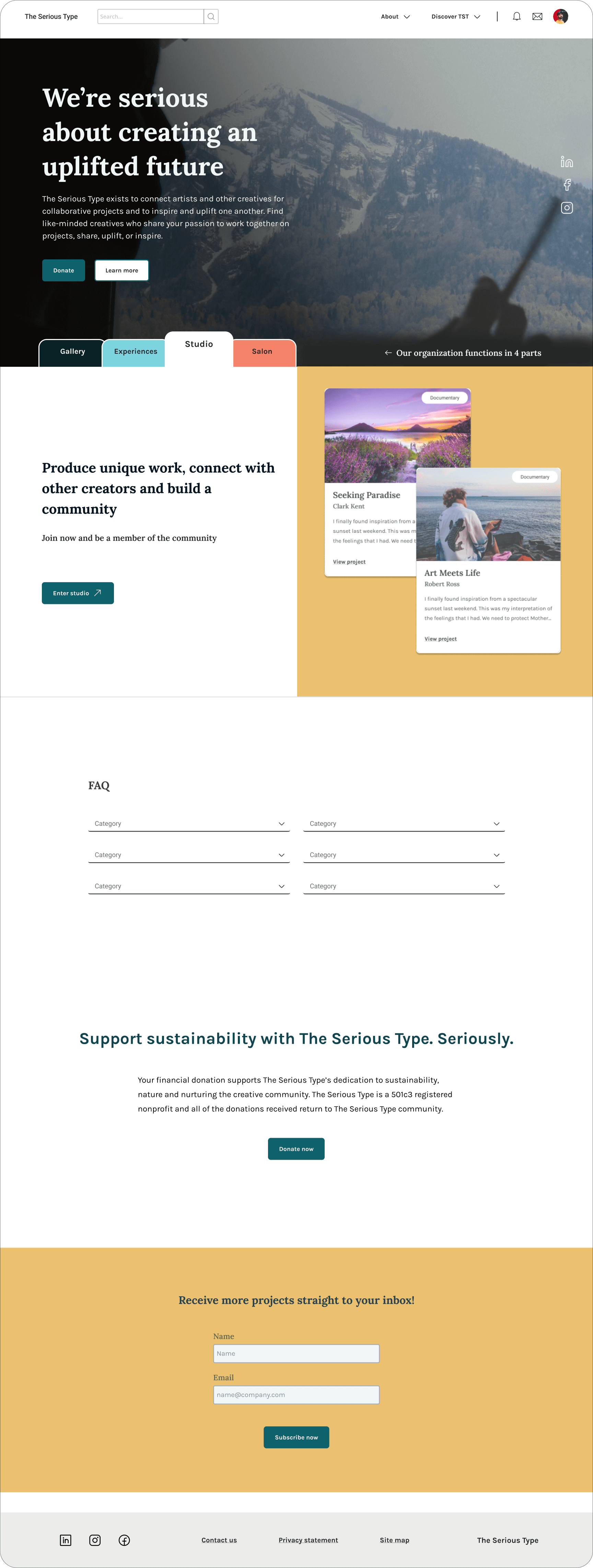
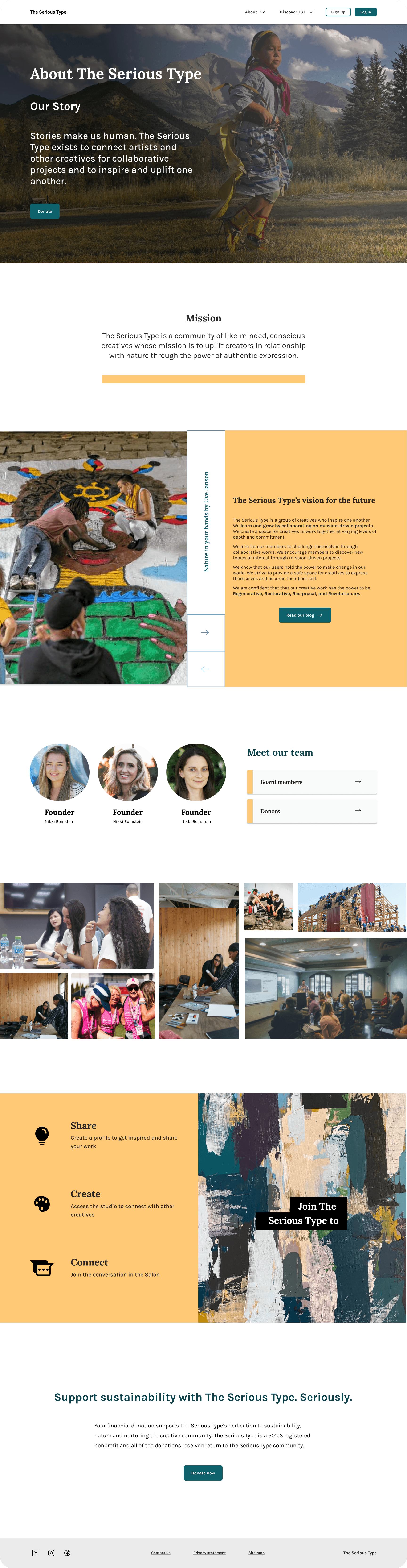
Design Progression: About Us Page
The About Us page was content-heavy, so my Content team worked on the initial wireframe, then consulted with the Design team from that point through the final version.
Lo-fi
Story and Mission sections “above the fold”
Sections are prioritized and in order, ready for Design team
Mid-fi

This was the first in-house/working copy from the Design team
Placeholder color shown yet
Dark color on white background looks a bit cluttered
Final About Us page

Added brand colors
Balance between images, text, and white space
Content Strategy: About Us Page
Goal: Inform users about TST at a glance
Story and mission sections above the fold
Well-articulated mission statement
More detail as you scroll down
Progressive disclosure
Video of About Us page
Final Client Demo
The “story” of this sprint
All teams worked closely on this cross-functional presentation, laying out the “story” of this phase, including the reasons behind processes and decisions.
Research insights
How research influenced design
Updates made after rounds of user testing
How specific changes in language, color, and interactive elements solve problems indicated by research
Prototype walk-through
Design team walked through user flows within the prototype:
Landing page — learning about TST
The 4 parts of this website
Entering a members-only area, a preview of what they could find there, then a pop-up CTA for signing up
Sign up/onboarding flow
Creating a new project, with options for both privacy and collaboration
Adding a collaborator to a project
Posting an update to a project
Landing page showing the 4 parts of this website
Content team concluded with short-term action items that would provide the greatest immediate benefits:
Clear, easy-to-read Mission & Vision statements
Change specific navigation labels that did not perform well during user testing (e.g. Salon, Threads, and Media)
Develop tighter branding and marketing strategy
Identify brand color palette
Update logo for brand recognition
Consider partnering with existing creative and mission-driven communities to expand outreach
Wrap-up
Development team addressed questions about the hosting platform.
Product team spoke about the vision and future of this product.

“I love everything you presented today and saw how it all came together...Overall I think you brought great value to this segment of The Serious Type.”
“You left us a really great container and direction to love forward with.”
“I want to take a moment to recognize [the Content team] for how much work you both did during the final sprints. You both accomplished so much in that short period amidst your individual schedules... I really love how the Content Style Guide turned out, and the About Us page.”
Takeaways / Retrospective
What went well
Strong alignment and communication across and within teams
Cross-functional team Slack channel to trigger impromptu Figma co-working and feedback sessions
Staying focused on the MVP and proactively verifying the work was within project scope
What didn’t work
Frequently client revisions
Lack of stakeholder commitment to brand direction
Cross-functional meetings encroached upon Content team’s time, prompting schedule adjustments
What I learned
Client would have benefitted from workshopping prior to each project phase, and committing to decisions made in the workshops.
Asynchronous, agile remote teams function more effectively when their schedules or time zones align periodically — to build stronger working relationships, clarify priorities, and streamline tasks.
Recommend clients use laptops or desktops during design reviews to more effectively understand and engage with solutions.
Screens